
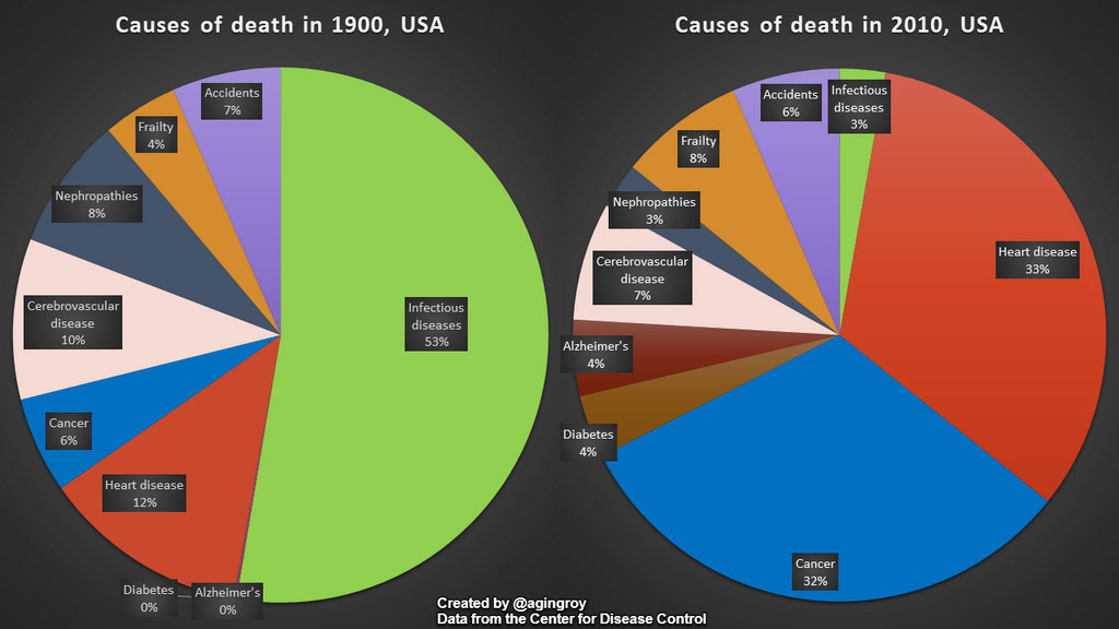
PhD research candidate Avi Roy created the following graphic that compares causes of death in the United States in 1900 with 2010. Can you spot what’s missing?
Here’s a hint: the data (once again) doesn’t match the gun control rhetoric from the Democrat party. For more information, check out How Americans Die.
Where the hell are guns? Or living in Chicago?
Damn pie charts, should only be used to server pie on.
I am all for pie while I grin and listen to the libtards scream that 99.8% of American deaths are due to guns and Tea Partiers
I’m continually surprised that there are actually people who believe the BS that the Democrats (or Republicans) say.
Bingo.
The public should really know about the number of deaths due to medical errors. It’s around 100,000 per year but frankly, life is so much easier not knowing the fact that going to the doctor or the hospital can kill you.
The Libs never let the truth stand in the way of a good story! (lie?)